

Web Design 5 Sep, 2023
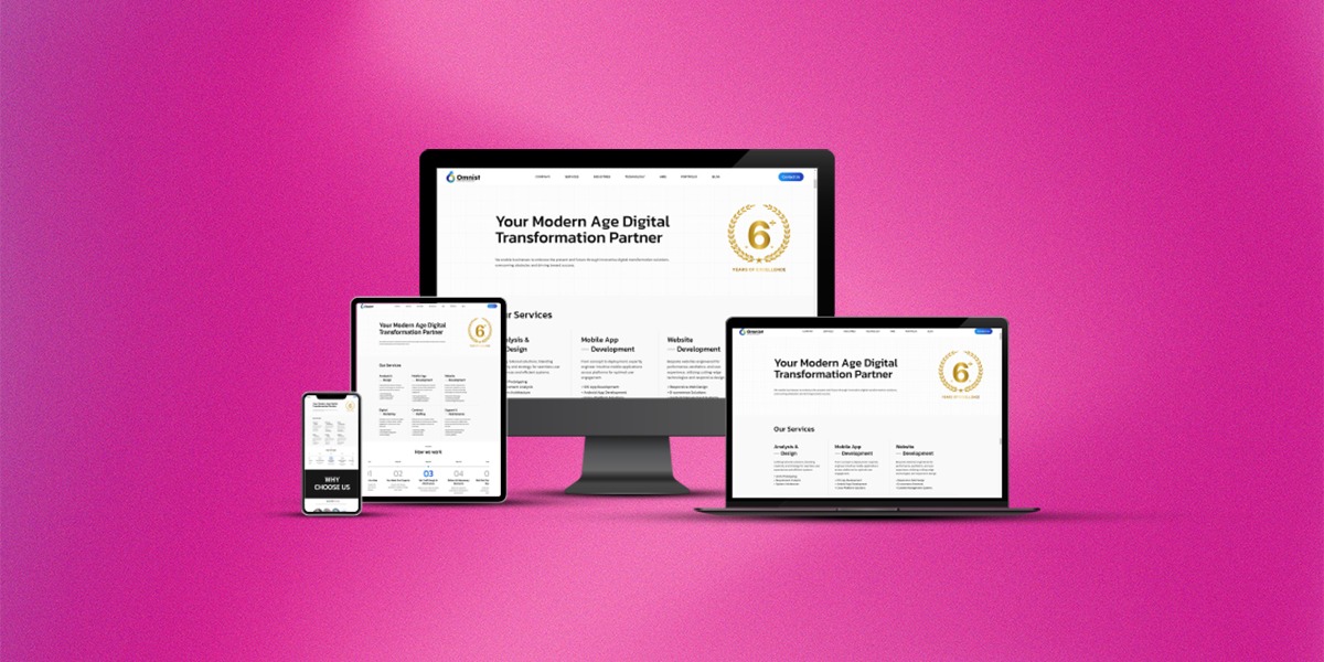
Building Responsive Websites for Different Devices and Screen Sizes

Writen by Akash Bais
Introduction
In today’s digital age, where online presence is paramount, building a website that caters to users across various devices and screen sizes is essential. The surge in mobile device usage has transformed the way people access information and interact with websites. As a leading player in the tech industry, Omnist Techhub Solution recognizes the importance of responsive web design and its impact on user experience, engagement, and overall success. In this blog post, we delve into the key aspects of building responsive websites that seamlessly adapt to different devices and screen sizes.
Understanding Responsive Web Design
Responsive web design is an approach that ensures a website’s layout, images, and other rudiments acclimate fluidly to accommodate the screen size of the device being used. Whether it’s a desktop computer, tablet, smartphone, or any other device, a responsive website maintains its usability and visual appeal. At Omnist Techhub Solution, we believe that creating a responsive website involves a combination of flexible layouts, fluid images, and media queries.
Flexible Grids and Layouts
One of the cornerstones of responsive design is the use of flexible grids and layouts. Instead of designing a fixed-width layout, a responsive website utilizes relative units like percentages for width and height. This allows the content to automatically adapt and fill the available screen space, ensuring optimal readability and aesthetics. Omnist Techhub Solution employs grid systems and CSS frameworks to create harmonious layouts that seamlessly transition between different devices.
Fluid Images and Media
Images play a pivotal role in web design, but they can pose challenges when it comes to responsiveness. Large images may not fit on smaller screens, leading to slow loading times and a compromised user experience. To address this, we implement fluid images using CSS rules that ensure images resize proportionally based on the screen width. Additionally, we utilize HTML5 features to embed videos and other media elements, guaranteeing compatibility across devices.
Media Queries for Device Adaptation
Media queries are the building blocks of responsive design, enabling websites to apply different styles based on the characteristics of the device or screen size. At Omnist Techhub Solution, we craft custom media queries to define breakpoints where the layout or styling needs to change. This ensures that users on various devices receive an optimal experience, whether they’re viewing a website on a large desktop monitor or a tiny smartphone screen.
Mobile-First Approach
In the era of mobile dominance, adopting a mobile-first approach is a strategic move. This approach involves designing for mobile devices first and then progressively enhancing the layout and features for larger screens. Omnist Techhub Solution emphasizes this methodology, recognizing that a well-optimized mobile experience sets the foundation for a responsive and user-friendly website.
Benefits of Responsive Design
Enhanced User Experience: A responsive website ensures that users can access and navigate your content seamlessly across all devices, leading to higher engagement and satisfaction.
Improved SEO: Search engines favor responsive websites, as they provide a consistent experience and reduce bounce rates, positively impacting search rankings.
Cost-Efficiency: Instead of maintaining separate websites for different devices, responsive design streamlines development and maintenance efforts, saving time and resources.
Future-Proofing: With new devices and screen sizes constantly emerging, a responsive design approach prepares your website for the future, making it adaptable to upcoming technologies.
Conclusion
In the digital landscape, where users interact with websites on a multitude of devices, responsive design has become a necessity rather than a luxury. Omnist Techhub Solution recognizes the significance of creating websites that provide a seamless experience across various screen sizes and devices. Our commitment to building responsive websites stems from our dedication to delivering superior user experiences, optimizing SEO efforts, and future-proofing our clients’ online presence. As technology continues to evolve, responsive design remains a cornerstone of our approach to crafting innovative and impactful web solutions.


