Kaam Keeda
- Category Website
- Technology PHP
- Start Date 06 May, 2024
- Handover 31 May, 2024

Transforming Job Placement Services
Visual and Typography Hierarchy
Kaam Keeda prioritizes visual hierarchy, leveraging the Inter font to optimize user experience. With its contemporary and legible design, the font ensures clear readability, essential for guiding users effortlessly through the app. Through meticulous arrangement of elements and highlighting their significance, Kaam Keeda's interface fosters intuitive navigation, enhancing user understanding and engagement.
-
Kaam Keeda places a strong emphasis on visual hierarchy, utilizing the Inter font to effectively organize elements and emphasize their significance. Through a strategic arrangement of menu icons and other visual components, users can effortlessly access information and navigate the app with ease. By logically structuring elements, Kaam Keeda shapes users' perceptions and directs them towards their desired actions.

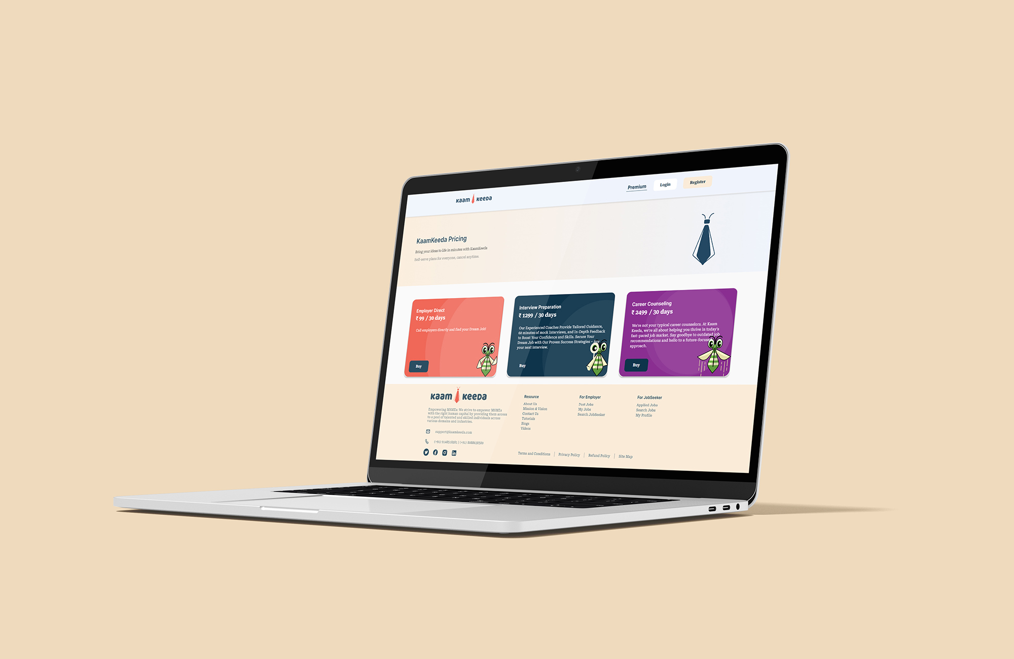



Kaam Keeda is leading the charge in revolutionizing the job placement landscape, introducing a dynamic approach to employment solutions. With a commitment to innovation and excellence, Kaam Keeda provides comprehensive services tailored to meet the evolving needs of job seekers and employers alike


