Deliveroo
- Category Mobile App
- Technology Android, iOS
- Start Date 15 Nov, 2015
- Handover 22 Jul, 2016
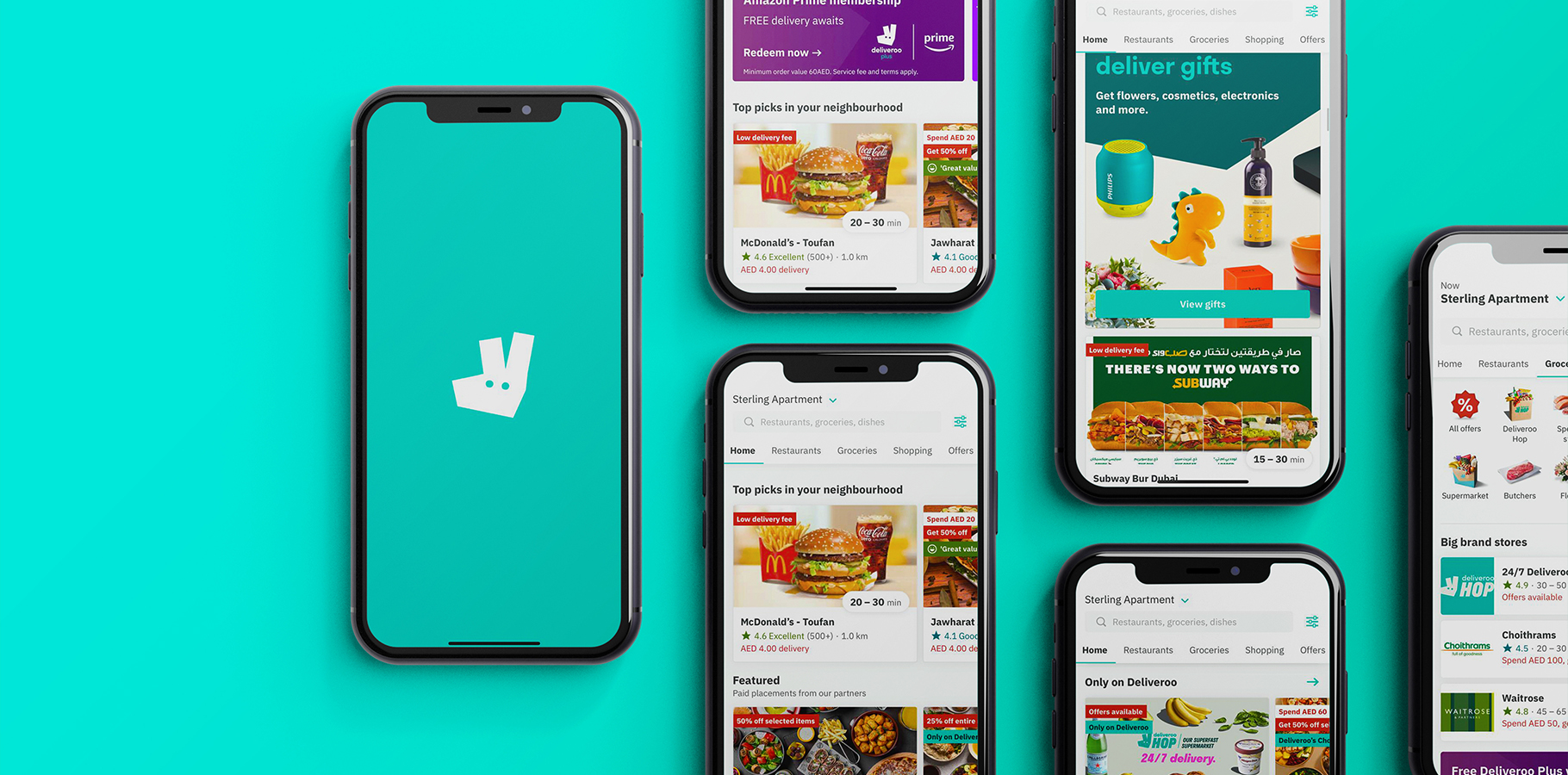
Restaurant food, takeaway and groceries. Delivered.
Visual and Typography Hierarchy
Deliveroo prioritizes visual hierarchy, utilizing the sans-serif font to arrange elements effectively and highlight their importance. With a strategic layout of menu icons and other visual characteristics, users can seamlessly grasp information and navigate the app effortlessly. By structuring elements logically, Deliveroo influences users' perceptions and guides them towards desired actions. This intentional design approach ensures that users notice key elements easily, enhancing their overall experience and increasing conversion rates. With Deliveroo and the Inter font, visual hierarchy becomes a powerful tool for creating intuitive interfaces that prioritize user understanding and engagement.
-
Utilizing the sans-serif font, Omnist has structured visual hierarchy in Deliveroo to enhance user experience. The font's modern yet legible design ensures readability and visual appeal, crucial for guiding users seamlessly through the app. Through strategic arrangement of elements and emphasis on their importance, Deliveroo's interface becomes intuitive, facilitating user understanding and engagement.
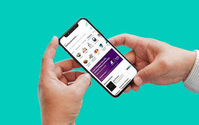
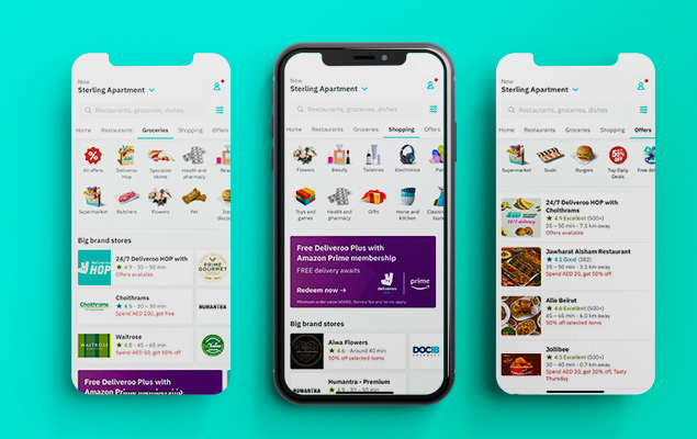
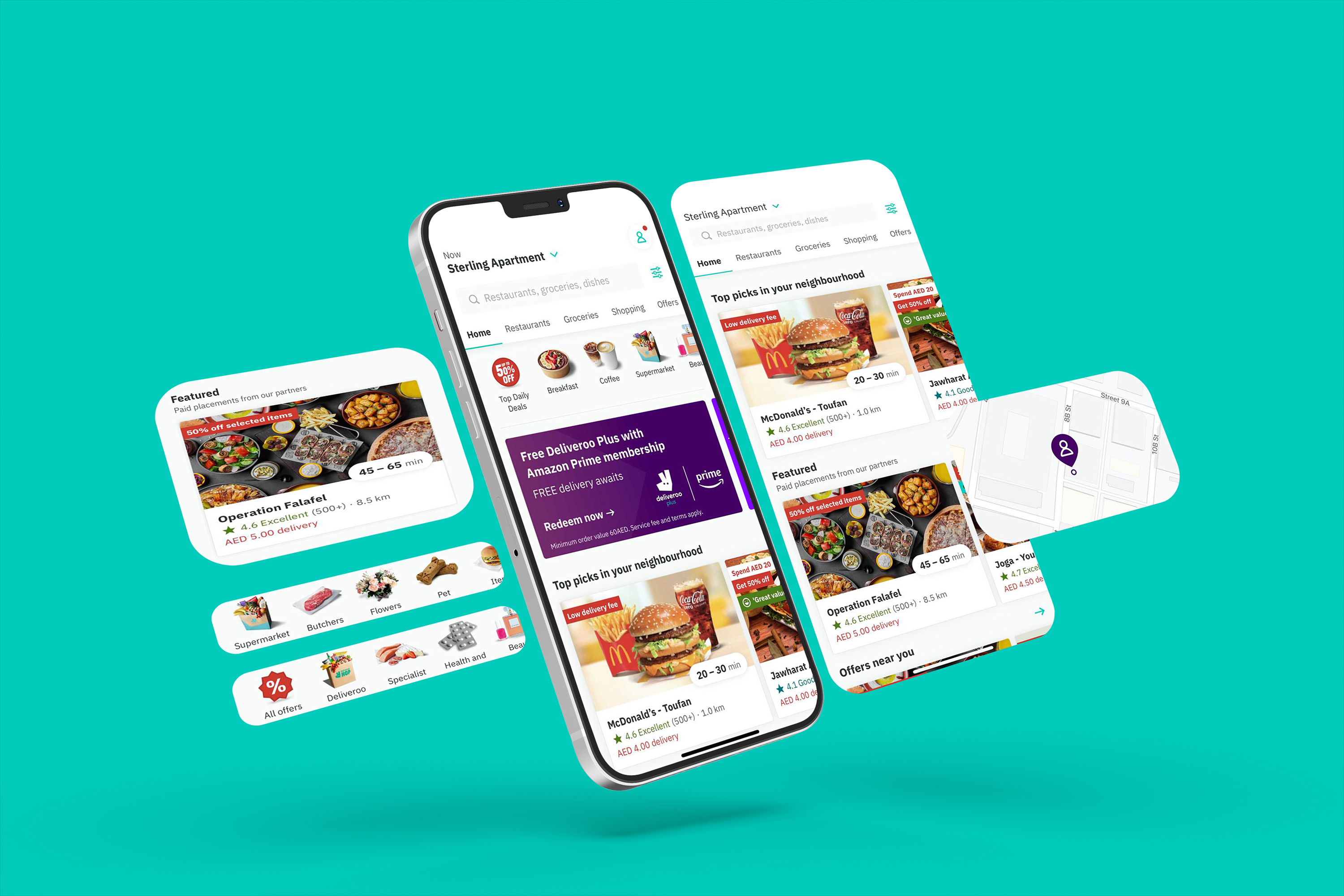
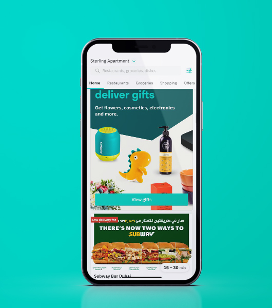
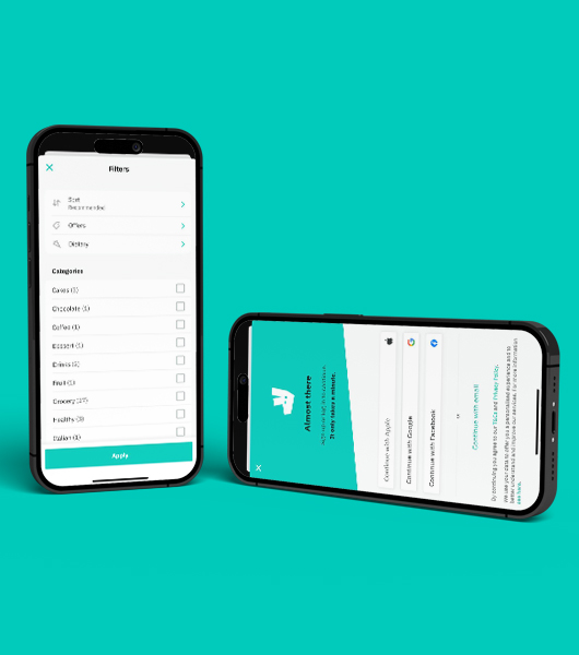
Deliveroo connects users to a vast array of local restaurants and grocery stores, offering swift delivery straight to their doorstep. With a user-friendly app interface, it provides seamless browsing, ordering, and tracking of deliveries, ensuring convenience and satisfaction for those craving quality meals or everyday essentials with just a few taps.


