InstaShop
- Category Mobile App
- Technology Android, iOS
- Start Date 01 Jan, 2015
- Handover 30 Jun, 2015
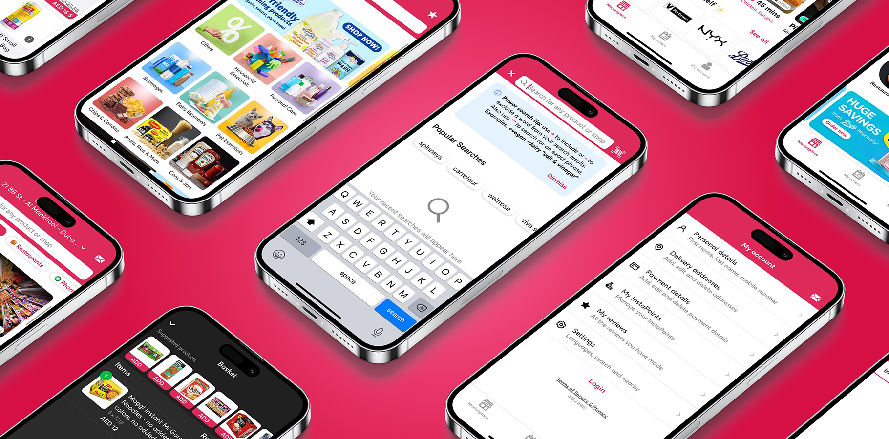
InstaShop: Grocery Delivery
Visual and Typography Hierarchy
InstaShop prioritizes visual hierarchy, utilizing the Inter font to arrange elements effectively and highlight their importance. With a strategic layout of menu icons and other visual characteristics, users can seamlessly grasp information and navigate the app effortlessly. By structuring elements logically, InstaShop influences users' perceptions and guides them towards desired actions. This intentional design approach ensures that users notice key elements easily, enhancing their overall experience and increasing conversion rates. With InstaShop and the Inter font, visual hierarchy becomes a powerful tool for creating intuitive interfaces that prioritize user understanding and engagement.

-
Utilizing the Inter font, Omnist has structured visual hierarchy in InstaShop to enhance user experience. The font's modern yet legible design ensures readability and visual appeal, crucial for guiding users seamlessly through the app. Through strategic arrangement of elements and emphasis on their importance, InstaShop's interface becomes intuitive, facilitating user understanding and engagement.
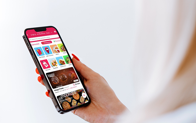
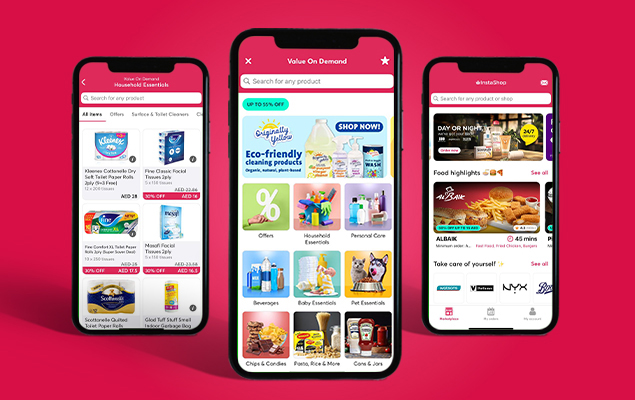
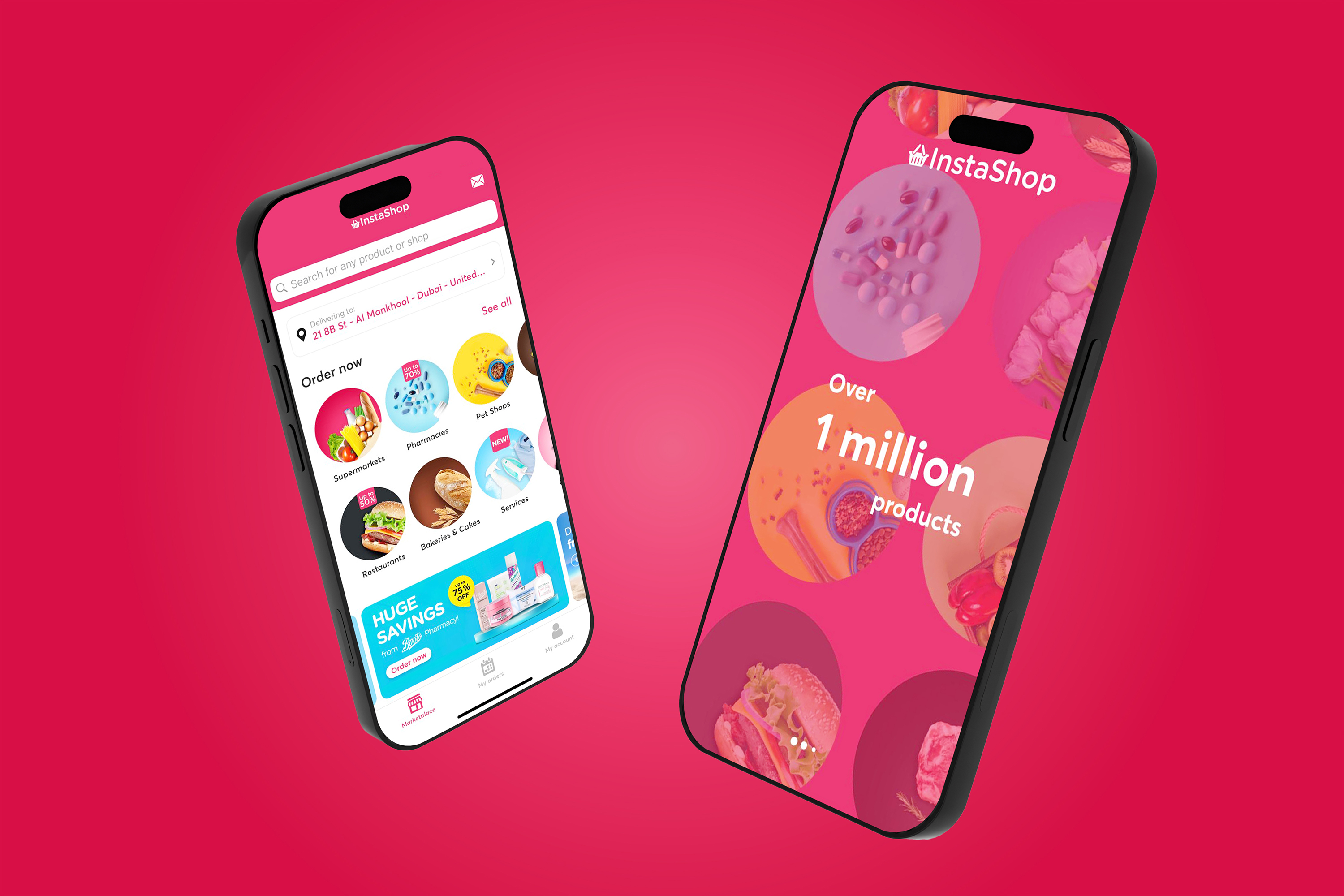
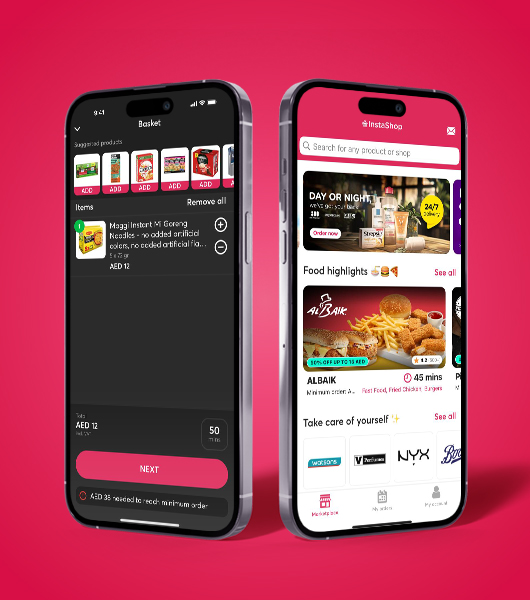
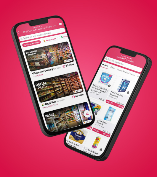
InstaShop, designed by Omnist Techhub Solutions, streamlines grocery shopping with a sleek, user-friendly interface. Leveraging the Inter font for readability, it offers seamless navigation, real-time tracking, and a comprehensive product range, enhancing convenience and efficiency for users seeking quick and reliable grocery delivery from local stores.


